In the section about the codes, I wrote: “Codes are learned units through experiences. Does anyone claim the opposite, that there are codes inherent in human nature? Yes, to some extent. I will discuss those views in the section titled ‘Gestalt.’” This is the section titled “Gestalt.”
There is an often used example in semiotics: Writings on a piece of paper are, essentially, ink marks on paper. They turn into signifiers when one (the interpreter) recognizes them as graphemes (the smallest meaningful units in a writing system), forming words and sentences. Then s/he forms the connections with the corresponding concepts (signifieds) and understands the meaning by constructing signs.
Now, we know that writing can be printed using different styles of typography: If we print the same sentence on a piece of paper using the Zapfino font (which resembles handwriting), on another using the Times font, and yet on another using the Courier font, this will cause changes in the form of the signifier but the content will stay exactly the same. That is, since the sentence is the same sentence letter by letter in all three printouts, there should be no difference between their perceptions. If this were the case, many professions including the printer, graphic designer, advertiser, font designer would have been nonexistent.
The figure below shows the sentence “Breakfast will be served strictly between 8:17 and 9:54 a.m.” written in three different fonts: Zapfino, Times and Courier. The indicated times are a bit strange: why not 8:15 instead of 8:17? Why not 9:55 or 10:00 instead of 9:54?
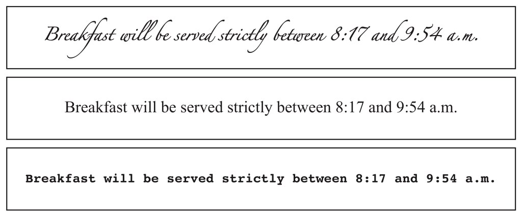
When we look at the Zapfino version, we may assume that there is humour behind it. For instance, it may be printed on an invitation to a wedding to take place at some hotel on a weekend. We can detect some humour if it is printed in curly Times font too, but not as strongly as in Zapfino. The Courier version, which resembles old-style, monospaced typewriter letters, will conceal the joke aspect the most, because we are used to seeing that typeface in official documents. For example, it may be part of a schedule for a military gathering where everything is planned in minute detail. Or, it still may be a joke and the issuer may have added a second dimension to it, with reference to official orders by using an official-looking font.
Certain types of publications customarily use certain types of fonts. Writings intended to be attention-grabbing, like titles, short announcements, posters generally use straight sans-serif fonts, whereas lengthy texts such as novels, stories, articles are often printed in curvy serif fonts. It is believed that serif fonts make reading easier. Why so?
Arguments over the readability of fonts have been going on for a century and have not come to a scientific conclusion as far as I know. I will, however, mention two different views in answer to the question:
The first view explains the differentiation with learning and conventions, as I explained in the “Codes of Signification” section. It states that people have formed associations and codes as a result of seeing certain types of publications printed in certain fonts. As shown in the figure above, typefaces have acquired connotational identities. The reader has gotten used to seeing novels, stories, expensive magazines, fancy restaurant menus, wedding invitations printed in curvy fonts and has developed expectations accordingly. “Readability” is not tied to the shape of the font, it results from the familiarity and comfort with the presentation.
The second view explains the matter with certain innate visual tendencies. It is suggested that we subconsciously connect the ends of separate but connectable lines to each other and, therefore, readers of Times-like fonts imagine connections between the curves and the text acquires continuity and flow. Similarly, the closures at the tips of the letters inherently create a sense of completeness and make the recognition of letters easier. In other words, this view suggests that certain innate tendencies in the human brain function as codes in the interpretation of the signifier. Below, I will try to explain the thoughts behind this alternative view.
* * *
The uniqueness of the shape of each snow crystal is an amazing phenomenon that is talked about quite a bit. The amazement is certainly normal given the uncountable number of snowflakes. However, I wonder why we don’t pay much attention to the uniqueness of other objects in nature, microscopic or not. Perhaps it has something to do with the complex and symmetrical structure of the snow crystals which we consider to be “beautiful.” Indeed, no “measurable” object in nature is an exact duplicate of another: it is not possible to find two leaves, two stones, two oysters, two clouds, two deers, two humans that are exactly alike in size, structure and texture.
What does this show us? It shows us that nature couldn’t care less about facsimile. If so, why do humans care so much about it? That’s because they have to fight the randomness and entropy in the natural “order” to survive. Acts like classification, categorization, division into equal pieces, grouping, measurement, symmetrizing, repetition represent both the weapons used in the fight and the admission of humans’ insufficient capacity to survive in the natural order. In short, we can say that humans have a constant inclination towards simplifying their universe and minimizing the unpredictabilities to be able to deal with nature. In other words, we tend to “cheat” whenever possible.
At the beginning of the 20th century a movement in the field of psychology called “Gestalt” was begun in Germany. The dictionary meaning of “gestalt” is “form” or “figure.” Here is a very coarse summary of the views set forth by the Gestalt psychologists:
There are particular universal characteristics in the visual perceptions of human beings. Experiments have shown that humans perceive and interpret certain basic images in particular ways, attributing repetition, order, symmetry and simplicity to the images. These are innate tendencies.
Gestalt psychologists use the word “prägnanz” to describe this type of perception, which means “conciseness” or “succinctness” in German. They offer a list of tendencies aimed at achieving concision, which are known as “gestalt laws” or “gestalt principles.”
Here are the very basics of the Gestalt principles:
The “preferences” involved in visual perception serve three general “opportunistic” purposes:
1. Reduction: We overlook things that don’t serve the purpose or that are hard to see.
2. Completion: We use the “hints” in the image to complete or fill in the missing parts.
3. Organization: We bring certain items in the image to the foreground and keep the others in the background.
 Gestalt findings focus particularly on the “organization” process and foregrounding/backgrounding. The most common example to this is the faces/vase figure known as “Rubin’s Vase.” This cognitive optical illusion figure gives two options to the beholder: you either see a white vase in front of a black background or you see two black faces looking at each other with white background. What is interesting is the impossibility of seeing both figures at the same time, as “a vase in the middle of two faces looking at each other”: the brain pulls either one or the other to the foreground. If you print the figure on a piece of paper (without any white space around it) and try to see it not as a drawn picture (iconic sign) but as some big black stain on paper, you won’t succeed: the force of representation won’t let you do it. You may be able to do this by turning the paper upside down or bringing it very close to your eyes so you cannot see the whole.
 One other popular image used as an example of the dual either/or option is the “rabbit-duck” drawing. As in Rubin’s Vase, you either see the head of a duck or a rabbit, not both of them together. We should keep in mind that the image won’t work for the beholder who has never seen a rabbit or a duck in his/her life.
 You can see some of the Gestalt laws demonstrated in the figure on the right. One can find numerous examples and information about them on the internet (I would recommend Prof. Michael Bach’s website and The Illusions Index).
The Gestalt psychologists believed that there are certain innate, reflexive or “automatic” perceptions that do not reference codes. Yet, others argued that such perceptions are also learned through experience: they are solutions which humans develop at very early ages to deal with the physical surroundings and the requirements of daily life. Because we subconsciously internalize and habituate to them in the initial years of life, we can incorrectly assume them to be instinctive. These are internalized codes and they are not as universal as claimed: responses to certain images differ from one society to another.
 For example, the famous Müller-Lyer illusion is one of the common examples used in the argument. Two lines of the same length next to each other, one with arrow heads pointing outwards and one with heads pointing inwards, look different in length. Studies have shown that people who grow up in environments with fewer rectilinear objects tend to be less susceptible to this illusion (see Wikipedia).
Innate or not, the most important aspect of the perception preferences indicated in Gestalt principles is that there is no objectivity even at the simplest levels of perception. Image is not a sight we photograph impartially and objectively but something we “construct.” Even in the simplest processes of “looking,” humans do not view things as they are: they interpret them subjectively and conveniently. Reality is not a phenomenon existing on its own, independent of human experiences. Reality is not a predetermined absolute, it is relative.
As indicated, Gestalt psychologists have worked mainly on the perception of the visuals. Could their findings be applied to aural phenomena as well? For example, there is a belief in music which has been in debate for a long time. Music based on a minor scale evokes sadness, longing, solitude while music using major scales creates a sense of wholeness, happiness, satisfaction. (It is possible to list several works that prove this theory wrong but let us assume that it is true for now.)
What would be the reason for that? Could it be due to some innate aural perceptual tendencies as in the visuals? Or, could it be due to the physiological effects of vibrations on our ears and brains produced by certain combinations of frequencies? Or, could we be subconsciously interpreting the non-lexical sounds according to codes we have learned and internalized? Or, could we be forming the aural codes through associations with elements from the visual world? (Levitin, 38) As these questions indicate, it is quite difficult to apply the Gestalt findings to music (which I will be discussing in the section titled “Music Perception: Emotion and Meaning”). Yet, we may be getting closer to finding some definite answers as research intensifies utilizing new technologies.
